Trim - To Paint or Not to Paint

This question can cause a lot of hand-wringing for clients.   Painting dark paneling and trim can transform a room, but sometimes restoring an old finish can create beautiful drama.   I don’t have hard fast rules that I follow when designing spaces for clients.  It all comes down to the look we are trying to achieve, coupled with the architectural significance and quality of the millwork.

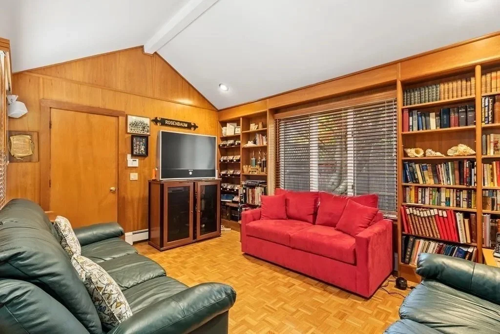
The easiest decisions are when the paneling is veneer and architecturally uninteresting.  In the study of this 1980’s era suburban townhome, we added battens to hide the seams in the veneer panels and a new face frame on the shelves to modernize the space.  Yes, it is the same space!

BEFORE: Wall to wall veneer with matching bookcases

AFTER: Battens were installed to cover seams in the panelling and a new face frame was installed on the bookcases

In a Back Bay condo, the baseboard and casing were in rough shape and needed patching so the decision to paint them was less of a decision than a requirement.   The doors, however, were a different story.  We removed the crackling shellac and applied a stained wax finish for a soft lustrous finish.

AFTER: The original finish on the doors was restored while all the trim was painted an off-white.

And in this Beacon Hill condo, we went from paint back to wood.  The original fir doors were covered in many layers of paint.  After having them chemically dipped and sanded, we decided they were just too pretty to cover them with paint, so we oiled and hung them. The doors look very dramatic against the dark stained flooring and soft white trim color. 

AFTER: Many layers of paint was stripped from original fir doors.

There is no rule that millwork in one room needs to be treated the same as in other rooms so long as the rooms balance, or as I like to say “talk to” each other.  In this project on a circa 1890 Victorian in Newton, we restored the original millwork in the living room, but because of extensive repairs needed in the dining room, we opted to paint the baseboard and casing.   We also restored the fireplace and large pocket doors dividing the space.   It all works together so beautifully!

BEFORE: The dining room felt gloomy with all the dark wood. The wainscoting was removed and reused to panel part of a new bathroom.

AFTER: The dining room fireplace pops against the white trim.

BEFORE: The living room trim was in good shape.

AFTER: The trim is treated differently in adjoining rooms.

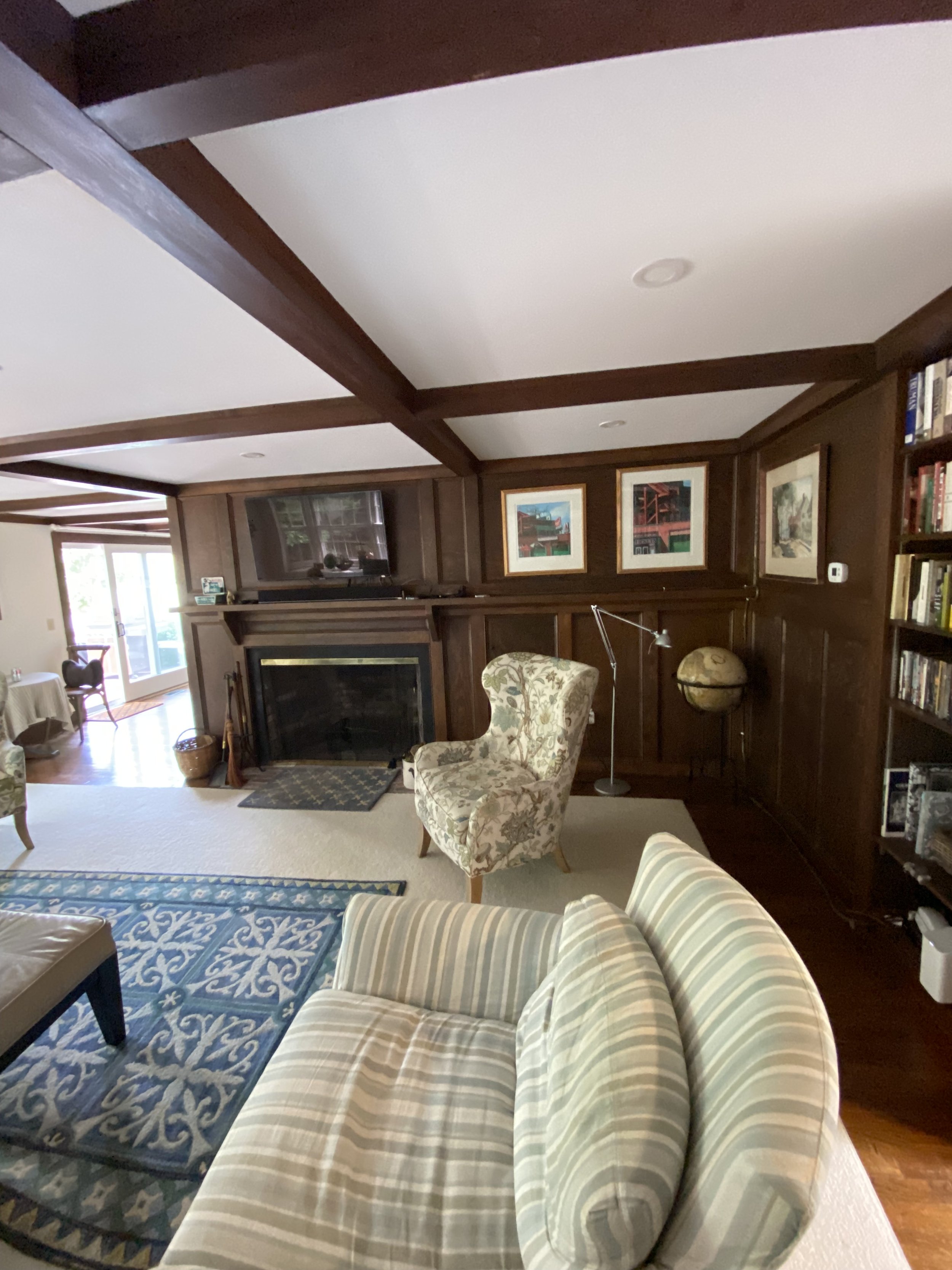
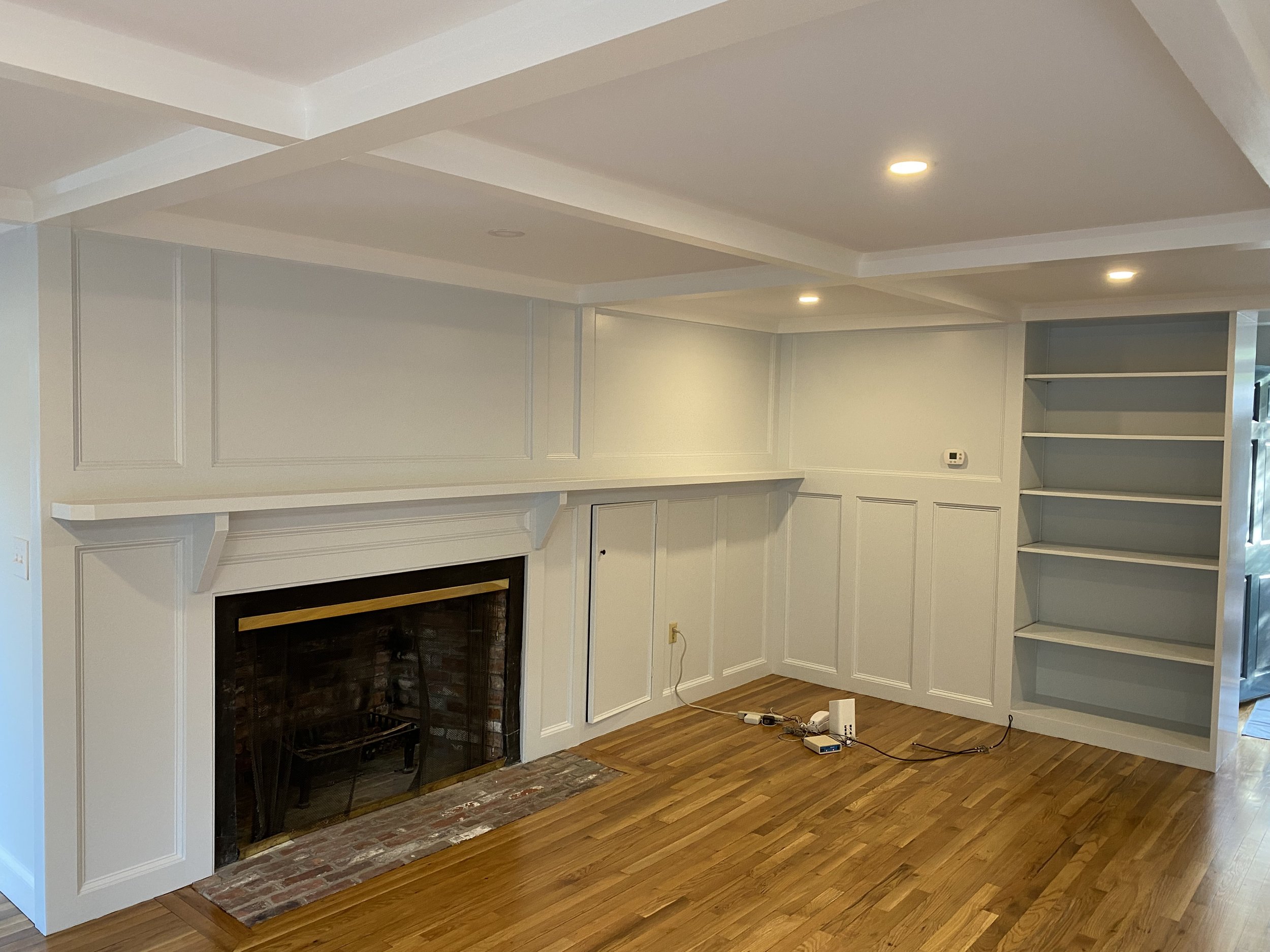
Sometimes the design choice calls for simply repainting all the dark wood because the client wants to lighten the space. There is no rule that you need to use the same color on all the trim and panelling. In the living room of this 70’s Royal Barry Wills Cape home, the ceilings, beams and crossbeams are in Ben Moore Super White (with different sheens) while the fireplace surround, panels and bookcases are in Ben Moore Silver Cloud.   The room transformation is quite dramatic.    

BEFORE: The original fireplace panelling and ceiling beams

AFTER: What a difference!


Thinking About an All White Kitchen?

A well designed all-white kitchen is a timeless classic.   It will look crisp and clean and never go out of style.  But white kitchens aren’t for everyone.   Some might find them too sterile, worry that they will be hard to clean or simply wish for more color in their kitchens.   For those who have their heart set on a white kitchen (and about half my clients do), here are some of the design elements I think about when pulling together an all-white kitchen. 

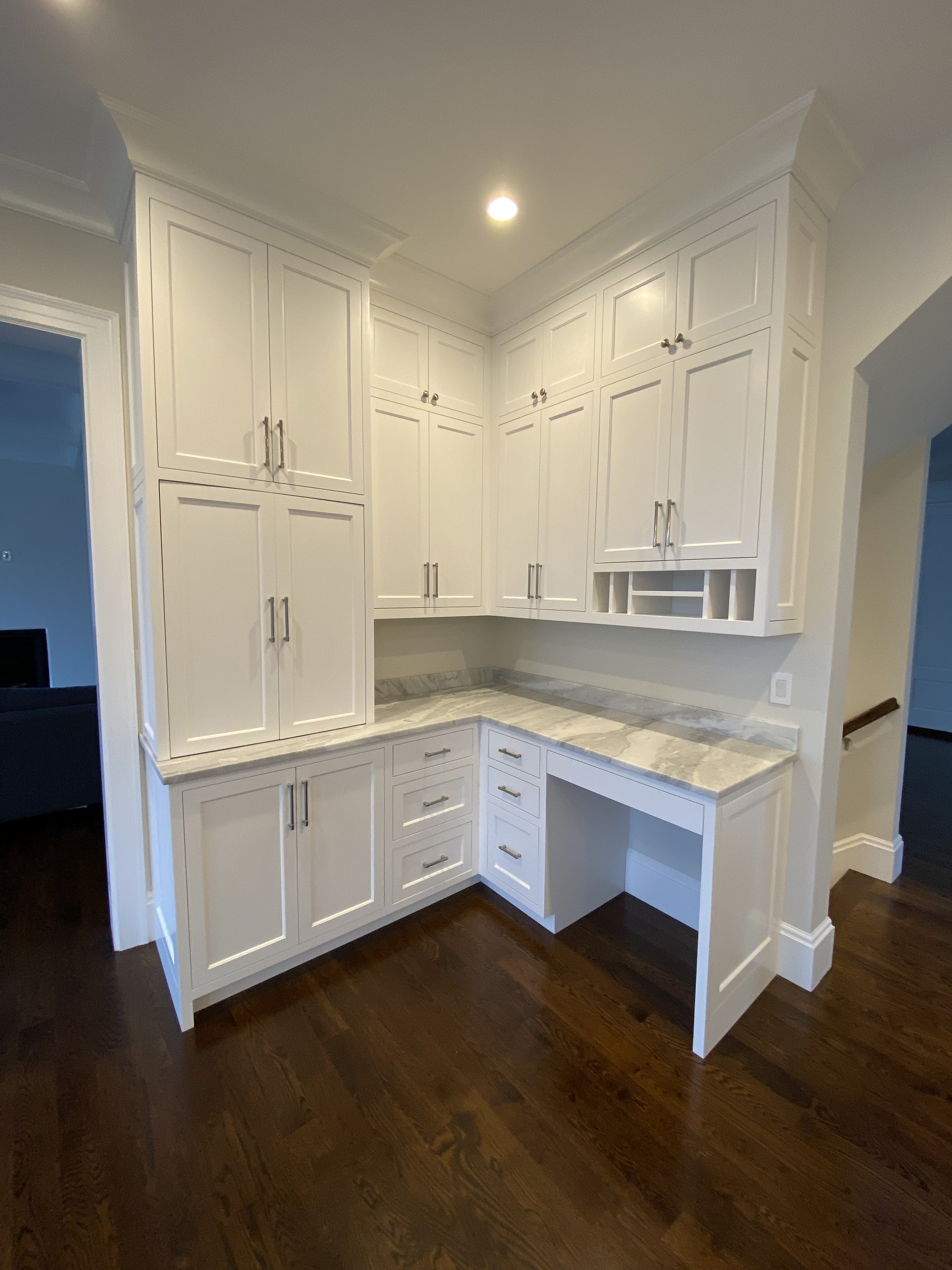
Take the cabinets to the ceiling.  The extra storage is a perk, but more importantly, it avoids the dark shadows in the space above the upper cabinets.

The ceilings in this Newton project were over 9’ high. The extra high cabinets in the coffee station and home office area allow the owner to store seasonal items like china and linens.

 Use or highlight visually interesting architectural elements.   White kitchens need “texture” and focal points to help the eye take it all in.   Cabinet layouts should take advantage of windows and their views.  Millwork and tile backsplashes can be used to create patterns to give the space visual depth. 

 In a Beacon Hill kitchen, a large window overlooking a beautiful side street helps to anchor the kitchen by creating an arresting focal point.  We used the same substantial crown moulding on our cabinets that we used in the rest of the condo.   We opted for tall and narrow shaker doors to both emphasize the high ceilings and to tie in to the paneling we installed in the entrance hall just outside the kitchen.  We added a little flourish above the integrated refrigerator with a custom milled air grille. 

And in this Newton kitchen, we created visual interest behind the stove by using the same subway tile as the rest of the backsplash but run in a herringbone pattern and framed with thin pencils.  As with anything “simple,” this look required a fair amount of planning behind the scenes to get the symmetry and layout just right.  Kudos to the tile installation crew!

Remember that anything that is not white will be noticed against a white backdrop.  This simple fact can be a pro and a con.   A vibrant backsplash, wood trim or appliance finishes will make a statement but so will the items you store on the countertop.  If you want a clean look, be sure that your kitchen has enough storage (and the right kind) to store anything that might accumulate on your countertops. 

 In this Brookline project, we added a whimsical glass tile backsplash to add a little color behind the Wolf range.

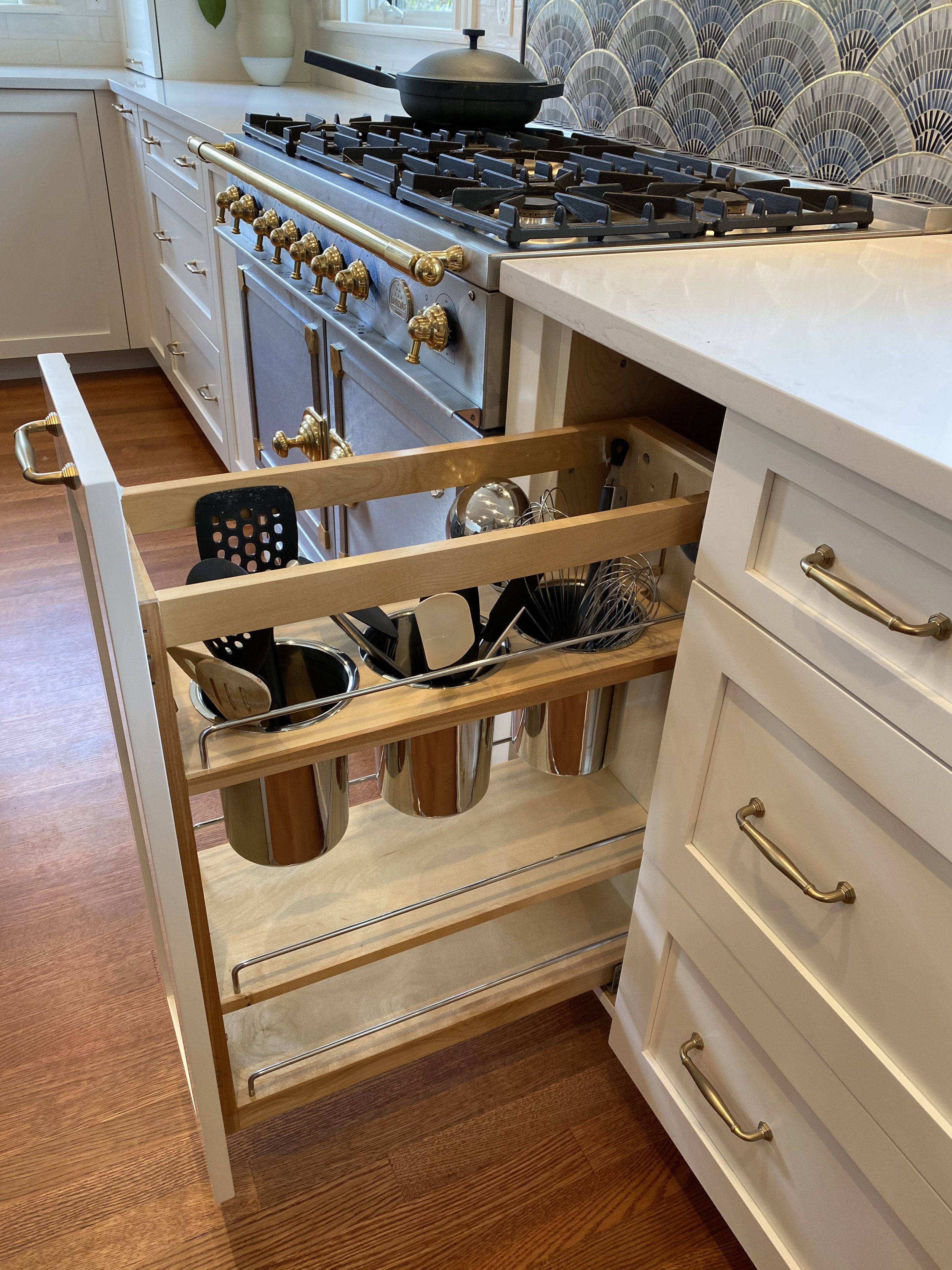
In this Newton kitchen, we added dedicated drawers for utensils and cooking oils and spices on either side of the Cornufe range. 

 Consider flooring color.  White kitchens on light color floors will look dramatically different than white kitchens on darker floors.  Be careful with light floors because without some contrast, the space can feel a little flat.   Contrast can add dimension. 

In this Beacon Hill kitchen, we installed a white washed white oak floor throughout the open floor plan and opted for darker base cabinets and white uppers.  The darker bases help to ground the space and create balance with the living area at the front of the house.  

Pick the right white paint color for your light conditions.   Finding the right white might be the hardest part of the design process.  There are hundreds of whites, and off-whites for that matter, from which to choose.  White paint can run cool or warm depending on the underlying hues in the paint and source of light.  Cool whites are brighter with undertones or blue, green or gray.  Warm whites are softer with yellow or red undertones.    Northern facing windows will cast more bluish light while southern facing windows cast more golden light.  A cool white paint is going to look a lot cooler in a northern facing room than a southern facing room.  It is super important to test samples of your paint choices in the actual kitchen space so you can see how the color presents itself at various points in the day.  Paint chips in one room can look completely different in another room. 

There is no rule that you need to use the same white throughout your kitchen, although I recommend keeping to the same “cool” or “warm” family.  I typically will use the same color on any crown moulding or baseboard that directly overlaps cabinets, but there is no reason why you can’t use a different white for window sashes and casing or wall colors. 

What's In A Name

The name Ruche Design was inspired by a bee motif wallpaper founder Karla Usalis chose for her first commission. Ruche is the French word for beehive. The name evokes not just a beautiful wallpaper, but also all that a beehive symbolizes: productivity, livelihood and a community that works for the whole.

Your home is your beehive, a place to shelter, work, rest, eat and above all, share time with loved ones and build lasting bonds. It should reflect your personal taste while being functional, well-built and balanced like the honeycomb of the hive.

The design process itself is also a hive of activity. It is a collaboration between homeowners, architects, contractors and the designer, each team member doing their part to bring the creative vision to life.

At the intersection of Interior Architecture and Interior Design

Good design starts with good function.   If the location of walls, windows or other structural elements don’t make sense in a room,  good design can make the room beautiful but it won’t substantially change how the room is used.   Think about modern kitchens -- trying to get a modern day kitchen with its appliance, storage and seating requirements into the same space that a kitchen from even just a few decades ago once occupied is challenging.  Older kitchens can be narrow or boxy with lots of doors leading to other spaces in the home.   They typically don’t have much counterspace for food prep or kid’s homework or drop zones, pet stations and home message centers.  


The Existing Kitchen Area

The Kitchen Plan


An optimally functioning kitchen might require that walls, doors and windows be moved to allow for a separate pantry, mudroom and/or powder room as well as an island. How people move through the house and enter the kitchen might need to be reconfigured to minimize bottlenecks and allow for two cooks to maneuver.  In some homes, you might be able to steal some space from adjoining rooms, closets and hallways, and in others, an addition might be contemplated.

The Kitchen “Before”

The Kitchen “After” From the Same Location

Kitchens aren’t the only room that might present a challenge.  How do you create functional space for a primary bathroom and walk-in closet?  Or carve out a home office or two?  What about a laundry room or exercise room?  On a typical project, we work through several iterations of room layouts with our client, in conjunction with an architect, structural engineer or general contractor, to find a solution that will work from both a lifestyle and budget perspective.   Only then do we proceed with honing in on the design elements.